College Football's Ugliest Uniforms of the 21st Century
College football teams have a long history of unique and sometimes questionable uniform choices. However, several programs have donned designs in the 21st century that have been widely criticized for their aesthetic flaws, sparking debate among fans and media. These sartorial missteps often clash with team traditions and mascot identities, leading to memorable, albeit negative, reactions. The following five uniforms stand out as particularly egregious examples, prompting widespread derision and a desire for them to remain relics of the past.
Michigan State's neon green ensemble, introduced in the 21st century, is a prime example of a uniform that deviates drastically from a program's established identity. The jarring neon green jersey emblazoned with "STATE" in an oversized font, coupled with lighter green pants and a neon "Sparty" logo, creates a visually discordant experience. This design stands in stark contrast to the disciplined, hard-nosed football image traditionally associated with the Spartans under coaches like Mark Dantonio. The uniform has been described as resembling a poorly conceived alternate design for another NFL team, or a creation by a young fan, failing to capture the essence of Michigan State's athletic heritage.
The Florida Gators' "Gatorskin" or "Swamp Green" uniforms, first worn in 2017 against Texas A&M, represent a conceptual idea that faltered in execution. While the intention to incorporate the alligator mascot and the "Swamp" environment is understandable, the final product was widely panned. The uniform featured a textured pattern on the jerseys, intended to mimic scales, but lacked a cohesive design with the pants. The orange lettering appeared garish, and the placement of a Gator head logo on one side of the helmet contributed to a cluttered and unappealing appearance. Despite the conceptual appeal, the execution led to such negative reception that the uniforms have not been seen in nearly a decade, though they are not considered the program's absolute worst by some fans.
Nike's "Pro Combat" series in the early 2010s aimed to modernize iconic college football uniforms, but the Georgia Bulldogs' iteration in 2011 proved to be a notable failure. Worn during the Chick-Fil-A Kickoff game against Boise State, these uniforms featured a gunmetal grey helmet with an overly wide red stripe, black sleeves, and a departure from the team's traditional clean aesthetic. The design choices, particularly the helmet and sleeve colors, were questioned given Georgia's established and well-regarded traditional uniforms and color scheme. The poor reception of these uniforms was compounded by the Bulldogs' significant loss to Boise State in the game, cementing their status as an infamous uniform choice that has since been retired.
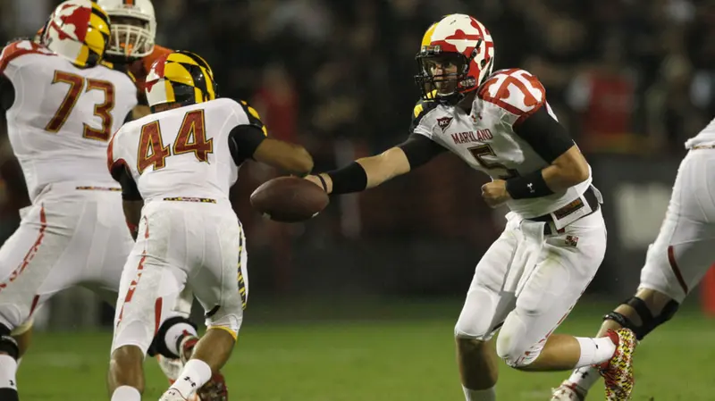
Maryland's decision to incorporate its state flag into its football uniforms in the early 2010s resulted in a visually overwhelming and widely criticized design. The complexity and busy nature of the Maryland flag, when applied extensively to jerseys, pants, and helmets, created a chaotic appearance that some felt was distracting. The uniform's design was so intense that it was humorously suggested it might offer an unfair advantage to the opposing team due to its visual overload. This approach overshadowed the program's unique mascot, the Terrapin, which had been underutilized in recent years. The uniform's excessive use of the flag elements led to a strong negative reaction from fans and observers.
Iowa State's 2023 "flesh-colored" football pants, worn in a game against TCU, are perhaps the most recent and widely ridiculed uniform choice. The decision to use pants that closely resembled skin tone created an unsettling visual effect, leading to widespread commentary and memes. The "throwback" design was criticized for its lack of aesthetic judgment, with many questioning why a different color wasn't chosen for the pants. The uniforms were described as making players appear as though they were playing without bottoms. The extreme negative reaction on social media likely ensured that this particular uniform experiment would not be repeated, earning it a place among the most questionable designs of the 21st century.
These uniforms, despite their aesthetic shortcomings, highlight the evolving landscape of athletic apparel and the fine line between innovation and tradition in college football. While some teams embrace bold new looks, others find that sticking to classic designs resonates best with their fanbase and athletic identity. The enduring debate over uniform design continues to be a point of interest for college football enthusiasts.
Share this article
Send the story to readers on social or messengers.
Comments
Loading comments…

New Times Reporter Staff
Compiled and edited by the New Times Reporter newsroom from wire and publisher reporting, with the original source credited on every story.